Kategorien
Uncategorized

The importance of lifelong learning is increasing, according to the co-founder of eduwo

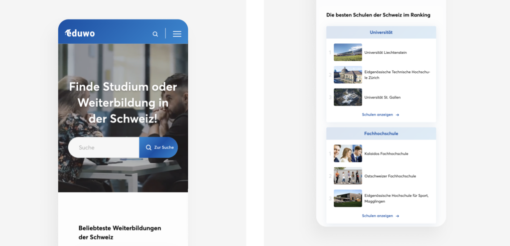
If you have ever thought about getting an education or continuing education, you are well aware of the many options. It is hard to get an overview, let alone being able to compare the different study programs and courses offered by universities and schools. That’s why Benjamin Vidas, now COO, and his co-founders decided to solve this problem by building eduwo – a platform that offers an overview of educational programs and guides people toward their ideal degree and profession.

After working with Benjamin and his team on the design of eduwo, we can confirm that this platform is definitely one you’ll want to check out whenever you’re thinking about getting an education. We got the chance to ask Benjamin about his vision, the things he’s learned the hard way, and the future of the Swiss education system.

On eduwo

What inspired you to start eduwo?

Fortunately, Switzerland has a diverse range of educational and professional opportunities. However, the large variety of choices can also be overwhelming. We founded eduwo so that everyone can find the right education for themselves.

Graphical user interface, application, chat or text message

Description automatically generated
On eduwo you find a ranking of programs and courses offered by Swiss universities and schools.

What advantages does eduwo offer over other career counseling services?

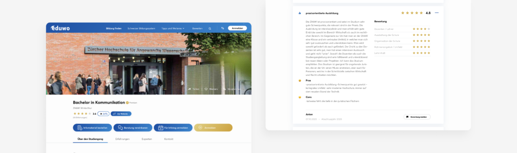
The advantage of eduwo is that users not only receive all the information about the schools and study programs, but can also benefit from the experiences of current and former students. Further, we connect between people looking for education, and schools or potential employers.

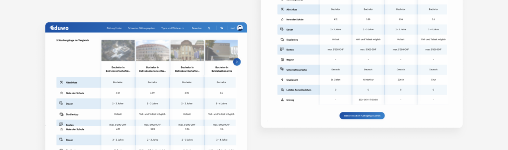
In addition, we have recently launched a brand new and innovative comparison function that allows direct comparison between various continuing education programs in a very user-friendly way.


What does success mean for eduwo? How do you measure it?

We are successful when our users – potential students and schools – are satisfied. We measure this by the number of users and the average time spent on our website. Most important, however, are the matches between users and providers – for example when information material gets ordered or a consulting meeting is requested.


Can you tell us about your revenue model?

Schools pay for a premium presence on eduwo – either a flat rate or per referral of potential students.

Graphical user interface, application

Description automatically generated
eduwo provides detailed information about study programs and courses including user-generated reviews.

How will the Swiss education system shift in the future?

I think that in the future everything will become more digital and much will take place over distance learning. This trend certainly got accelerated by the Coronavirus crisis.

Even schools that aren’t well-known yet will be more and more in demand, and the skills like programming and an understanding of IT will be increasingly at the forefront.

The importance of lifelong learning is also increasing. More and more people are frequently taking smaller and more specific courses, even later in life.

Furthermore, interdisciplinarity, the cooperation of different disciplines – for example artificial intelligence with marketing – is becoming very significant.

On leadership & strategy

What were the best decisions and where would you adjust certain steps you’ve made along the journey? What are the lessons from them?

My best decision was to start eduwo and to have the experience of building and developing the company. Certainly, there is always a risk of losing focus. Further, it is important to regularly assure that you spend the money on the right priorities.


Nowadays, there is a great number of advice and support opportunities for Swiss startups. How do you know which advice to follow and which to ignore?

I think it’s always important to get a second opinion on any received advice, and to take the time to discuss the inputs on important issues with the team.


This year you extended the eduwo platform by a feature that allows users to compare courses. What prompted you to do that?

There are thousands of study programs in Switzerland and all of them have different requirements, varying costs, advantages, disadvantages, learning content and study durations. Therefore, it usually takes a lot of time to find the right course. Thanks to this new function, the courses can be compared very quickly and easily, which helps a person a lot.

Graphical user interface, application

Description automatically generated
The recently launched comparison feature allows comparing thousands of Swiss study programs and courses.


How do you prioritize which features to build next?
Our platform always puts the user first and we try to continuously release innovative features for their needs. For example, based on the feedback from HR departments of companies, we will soon extend the new comparison feature so that it is optimized for companies. This way, HR managers can make it available for their employees and optimally propose possible paths for continuing education.

“Our platform always puts the user first and we try to continuously release innovative features for their needs.”


On Technology & Design

What have been the biggest technology challenges you’ve had to overcome? How were you able to master them?

We built the eduwo platform from the ground up. Creating a website from scratch comes with certain struggles. An example: SEO – search engine optimization. If you use WordPress, for example, there are SEO plugins available that allow content optimization on a website in order to rank higher on search engines quite easily. This does not exist when you build everything from the ground up. But of course, there are advantages or reasons that speak for programming it from scratch.


What would be your best technology-related advice to other startups?

Use well-known and established programming languages, keep it lean and start with a MVP! Furthermore, communication among the IT-developers, and between the business and the developers, is enormously important.

“Use well-known and established programming languages, keep it lean and start with a MVP!”


What were the biggest benefits to collaborate with Voa Labs?

One of the biggest benefits was to gain a professional outside perspective on the new comparison function. Also, to benefit from their top-notch design and UX skills which we don’t have internally. Another huge advantage was the fast and flexible implementation with agile feedback rounds.

For further information about eduwo and the comparison feature we designed together, read the case study.

Kategorien
Uncategorized

Top 10 Web Design Trends for 2021

Here’s a fact – there are around 200 million active websites. To stand out from the crowd and grab your target audience’s attention, you need a website that is easy to use, aesthetically designed, and provides your visitors with relevant information. More importantly, your website should be able to convey your company’s story interactively.

Now that you understand the importance of attractive web designs, you’re now able to start thinking about how to design a website that fulfills the above-mentioned criteria. Exploring the ongoing trends in the web design industry can help you get inspired and build a website that draws in visitors and stands out among your competitive landscape.

1. 3D visuals

Here are a few reasons why 3D elements are currently so popular in the web design industry – compared to 2D elements, they are often more attention-grabbing and engaging. The realistic look of 3D creates a sense of physical presence that is very natural to the human eye. The futuristic appeal of 3D visuals in web design can boost interest and the overall impression of your brand.

One of the best examples to illustrate this is Campo Alle Comete. The website, designed to advertise an Italian wine, shows a floating city in 3D that depicts the brand story while inspiring visitors.

Whaou is another perfect example of how 3D design elements can bring a website to life. The website allows users to create their own recipes by mixing different ingredients in an interactive kitchen.

2. Parallax animation

In the past few years, designers have witnessed a lot of web-based animation trends – a number of them have started to transform the industry. One such trend is parallax animation.

In a nutshell, parallax is the optical illusion that happens when the objects closest to the viewer appear to move faster than objects that are farther away. While we keep seeing the parallax effect in our everyday lives, seeing it on web pages feels both real and surreal.

Here are a few reasons why parallax animation is in this list of web design trends for 2021:

  • It can add a creative touch to an otherwise dull website.
  • It makes moving around a website attractive and hence encourages user engagement for a longer period of time. The more they stay the more likely they are to become customers.

Minh Pham is an amazing example of a web design using parallax animation.

The website, created by Anton Tkachev, uses parallax effects that respond to mouse positions and dashes of depth with 3D elements throughout their website. This is a great example of how parallax animation in combination with 3D elements can make an impressive impression.

3. Dark mode

For decades, web designers used the default background color – white – for websites. Lately, more and more websites and web apps have introduced dark mode: a simple toggle that lets you change the background color to black. Some websites even offer a dark mode only.

“Everyone can relate to being in a room where the lights are turned down and you’ve got this white screen blinding you”

Sameer Samat, Google’s VP of product management for Android and Play

Here are a few reasons why dark mode is trending in the web design industry:

A creatively made dark themed website is Eat Genesis. The website’s homepage shows a few figures along with an option to order food online.

Even the tech giant Apple uses dark themes for some of its web pages, as shown in the example below.

A screenshot of a video game

Description automatically generated with medium confidence

4. Asymmetric layouts

The asymmetric layout trend has been growing since 2019. The idea behind it is that a website should look less blocky as well as less straight-edged. There are various levels of asymmetry in design – from incorporating small asymmetric elements, to more extreme forms.

Asymmetric layouts provide designers with more freedom of design. Moreover, if used correctly, this layout can help to draw the attention of users to a specific area of the website.

A perfect example of an asymmetrical layout is Ryn Davis’s website. The visuals are not in symmetry – rather the opposite, but still looking appealing. The website is designed aesthetically with a few visuals and some text.

Felix Lesouef has divided his website asymmetrically into three parts. This provides his vertically organized website a lot of space for the content column.

5. Neumorphism

Neumorphism – one of the latest trends in the UI industry – is a portmanteau of ‘new’ and ‘skeuomorphism’. Neumorphic elements pretend to extrude from the background. This extruded look can be achieved by using light and shadows around the elements. Unlike Material Design elements, neumorphic elements do not “float”.

Image for post
Source: Michal Malewicz

The „Rent a Vespa Now“ button on this site designed by Sara Salehi is a great example of how neumorphism can elevate a modern and minimalist website.

Another example is how George Tang created a concept landing page with neumorphic style elements.

If you’re looking for a handy generator to create CSS code for neumorphic elements, head over to: https://neumorphism.io

6. Geometric grids

Geometric grids are indispensable when we look to create a website that is clean and harmonious. In simple words, a grid is a structure that comprises a series of lines (vertical and horizontal) that divides a web page into columns or modules.

Geometric grids help to systematically order details and information while looking appealing and synchronized.

Hudson Garvin Martin’s website is a great example of how geometric grids can be used in web design. The website uses clearly defined blocks for navigational purposes as well as to store content.

Malika Favre’s website is a perfect combination of bold and minimal art in a grid layout.

7. Cartoon illustrations

Not so long ago, websites were just about text and graphics. However, since then things significantly changed for the better. Web design is now increasingly about establishing a connection and engaging with website visitors. One of the ways to do so is by including cartoon illustrations in the web design.

A website that makes the process of browsing through it fun is Toy Fight. The website illustrates two characters who keep fighting throughout the entire website. Each page shows the same characters in different poses.

Another example of a website that has creatively used cartoon illustrations is Tubik Studio. Instead of using photographs of its team members, it has used cartoon illustrations for each member.

8. Scrolling transformations

When users visit a website, they’re doing more than simply scrolling – they’re interacting with the interface. Now that present-day designers are keen to turn all types of interactions into memorable experiences, the scrolling transformation has emerged as a trend.

Scrolling transformations can range from full-color scheme variations to complex animated layout transitions. It’s natural that eyes get attracted to movement – hence when unexpected changes happen as users scroll, it will keep them engaged.

Here’s an amazing example of scrolling transformation designed by Vilius Vaicius. The web design provides users with a new experience every time they scroll, making it a truly amazing experience.

Outer Studio uses an eye-catching array of scrolling cards and seemingly non-moving artistic images and forms.

9. Colorless design

Lots of white space and keeping most elements black or gray makes for a clean design. Any colorful element placed in a colorless design gets special attention. Plus, a colorless design can speed up your design process as you spend no time choosing the “right” colors.

In the example below, User Experience Database chose a colorless design that is minimal and easy to read.

Diagram

Description automatically generated

The digital production company Salt & Pepper minimized their color selection to black and white, with some light gray. Images are the only colorful elements of the website.

Graphical user interface, diagram, application

Description automatically generated

Don’t be afraid to go colorless in 2021 with your own design work!

10. Gaussian blur

Blurry backgrounds have become a popular design choice for websites – gaussian blur being the most often used. The style has a calming effect and provides an elegant appeal.

Moment House places a delightful gaussian blur of color at the top of their website.

TimeNote 3.0 also uses the gaussian blur effect to draw user attention to the text by underlying it with a light splash of color.

Let’s embrace these design trends

We’ve covered the 10 top web design trends for 2021. Now it’s your turn to embrace these trends and build a website that can help your brand stand out.

We can’t wait to see all the websites that will emerge following these trends.