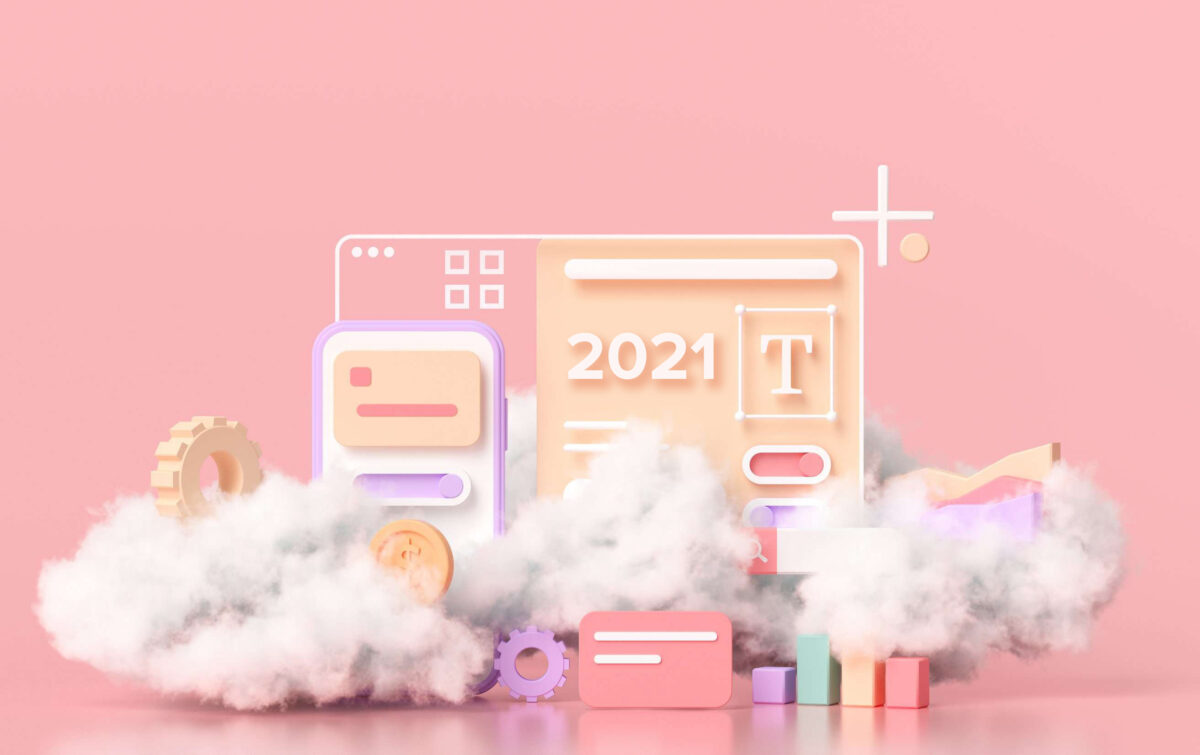
Here’s a fact – there are around 200 million active websites. To stand out from the crowd and grab your target audience’s attention, you need a website that is easy to use, aesthetically designed, and provides your visitors with relevant information. More importantly, your website should be able to convey your company’s story interactively.
Now that you understand the importance of attractive web designs, you’re now able to start thinking about how to design a website that fulfills the above-mentioned criteria. Exploring the ongoing trends in the web design industry can help you get inspired and build a website that draws in visitors and stands out among your competitive landscape.
1. 3D visuals
Here are a few reasons why 3D elements are currently so popular in the web design industry – compared to 2D elements, they are often more attention-grabbing and engaging. The realistic look of 3D creates a sense of physical presence that is very natural to the human eye. The futuristic appeal of 3D visuals in web design can boost interest and the overall impression of your brand.
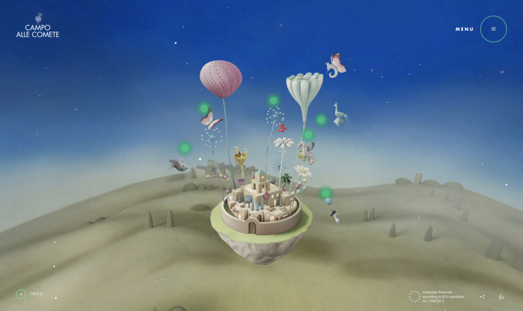
One of the best examples to illustrate this is Campo Alle Comete. The website, designed to advertise an Italian wine, shows a floating city in 3D that depicts the brand story while inspiring visitors.
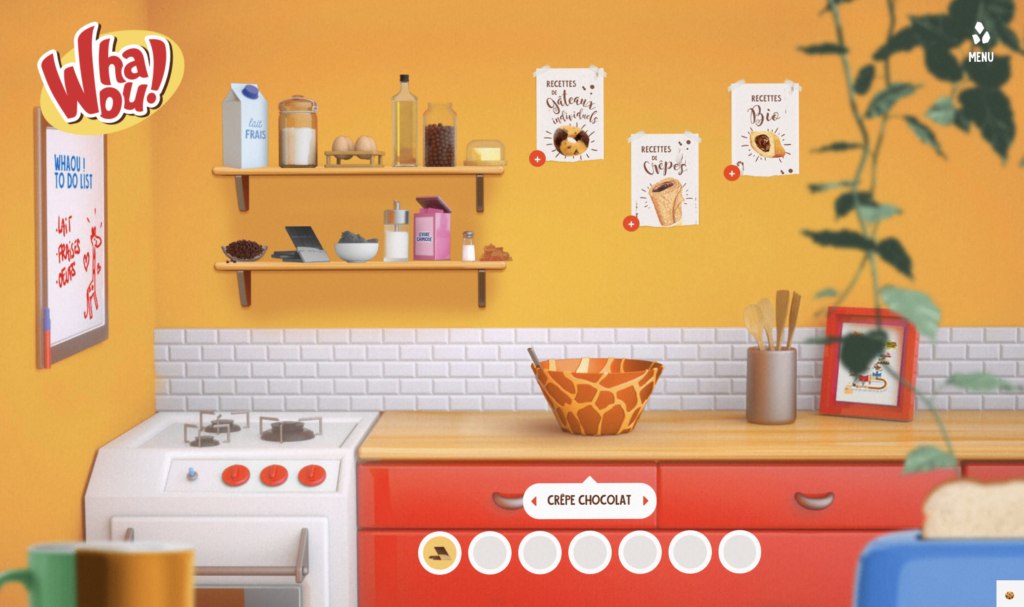
Whaou is another perfect example of how 3D design elements can bring a website to life. The website allows users to create their own recipes by mixing different ingredients in an interactive kitchen.
2. Parallax animation
In the past few years, designers have witnessed a lot of web-based animation trends – a number of them have started to transform the industry. One such trend is parallax animation.
In a nutshell, parallax is the optical illusion that happens when the objects closest to the viewer appear to move faster than objects that are farther away. While we keep seeing the parallax effect in our everyday lives, seeing it on web pages feels both real and surreal.
Here are a few reasons why parallax animation is in this list of web design trends for 2021:
- It can add a creative touch to an otherwise dull website.
- It makes moving around a website attractive and hence encourages user engagement for a longer period of time. The more they stay the more likely they are to become customers.
Minh Pham is an amazing example of a web design using parallax animation.
The website, created by Anton Tkachev, uses parallax effects that respond to mouse positions and dashes of depth with 3D elements throughout their website. This is a great example of how parallax animation in combination with 3D elements can make an impressive impression.
3. Dark mode
For decades, web designers used the default background color – white – for websites. Lately, more and more websites and web apps have introduced dark mode: a simple toggle that lets you change the background color to black. Some websites even offer a dark mode only.
“Everyone can relate to being in a room where the lights are turned down and you’ve got this white screen blinding you”
Sameer Samat, Google’s VP of product management for Android and Play
Here are a few reasons why dark mode is trending in the web design industry:
- Dark mode can help to reduce eye strain and its side effects.
- It increases interface or webpage visibility in low ambient lighting.
- It saves battery life, says Google.
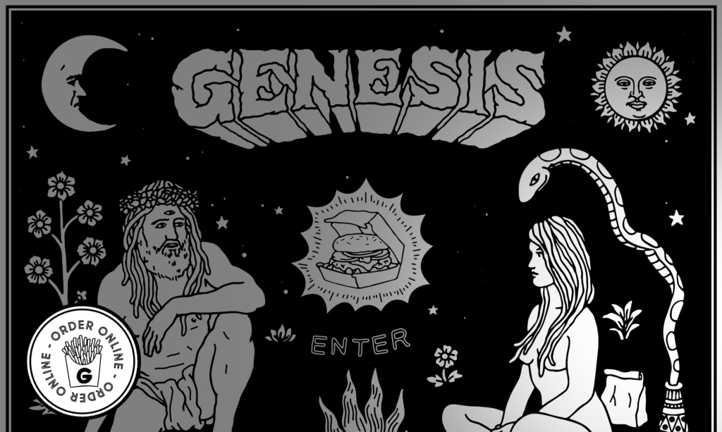
A creatively made dark themed website is Eat Genesis. The website’s homepage shows a few figures along with an option to order food online.
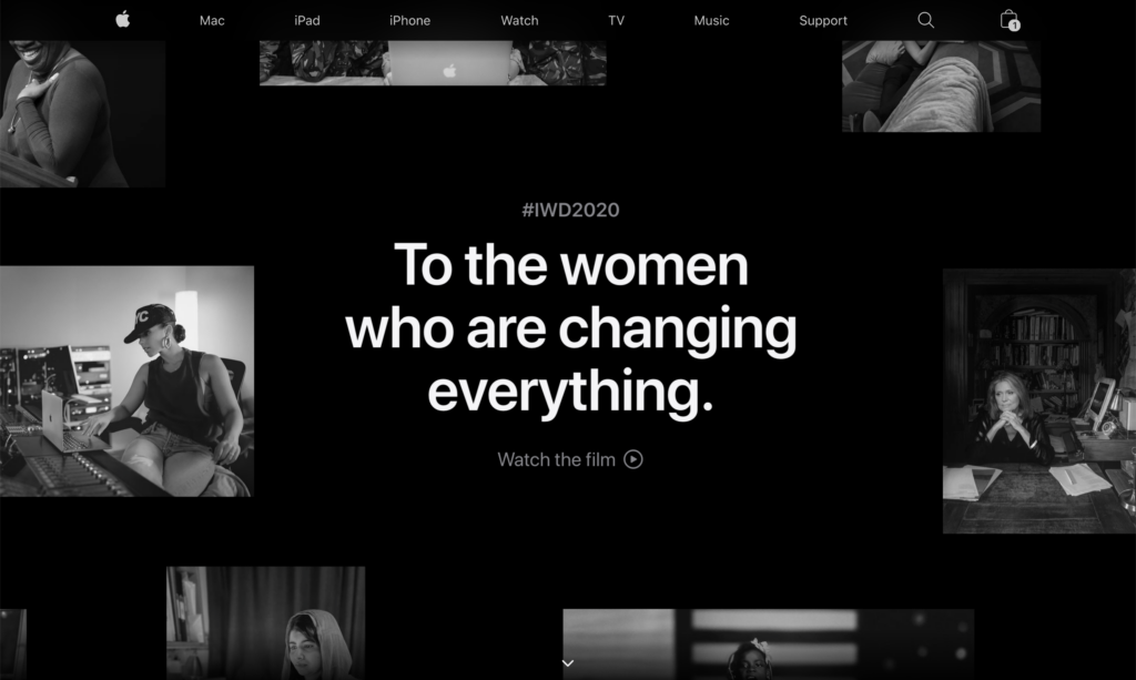
Even the tech giant Apple uses dark themes for some of its web pages, as shown in the example below.
4. Asymmetric layouts
The asymmetric layout trend has been growing since 2019. The idea behind it is that a website should look less blocky as well as less straight-edged. There are various levels of asymmetry in design – from incorporating small asymmetric elements, to more extreme forms.
Asymmetric layouts provide designers with more freedom of design. Moreover, if used correctly, this layout can help to draw the attention of users to a specific area of the website.
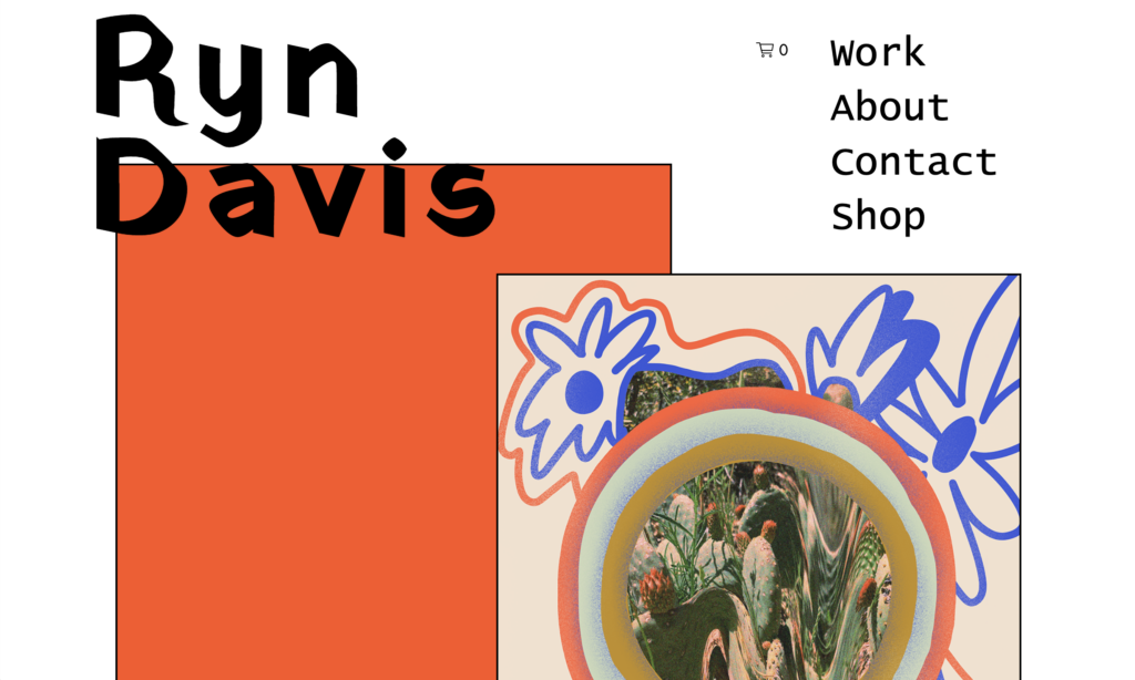
A perfect example of an asymmetrical layout is Ryn Davis’s website. The visuals are not in symmetry – rather the opposite, but still looking appealing. The website is designed aesthetically with a few visuals and some text.
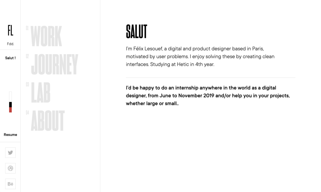
Felix Lesouef has divided his website asymmetrically into three parts. This provides his vertically organized website a lot of space for the content column.
5. Neumorphism
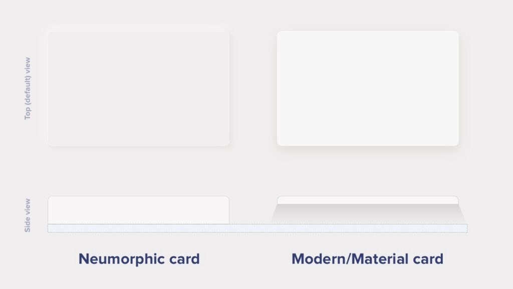
Neumorphism – one of the latest trends in
the UI industry – is a portmanteau of ‘new’ and ‘skeuomorphism’. Neumorphic
elements pretend to extrude from the background. This extruded look can be
achieved by using light and shadows around the elements. Unlike Material
Design elements, neumorphic elements do not “float”.
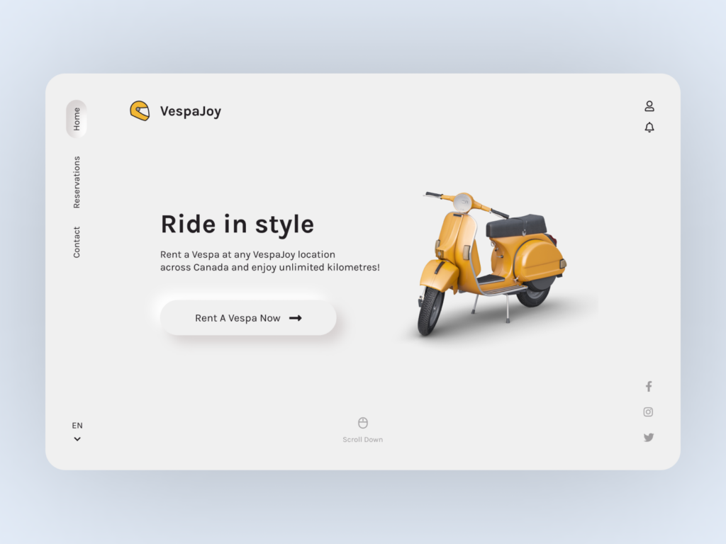
The „Rent a Vespa Now“ button on this site designed by Sara Salehi is a great example of how neumorphism can elevate a modern and minimalist website.
Another example is how George Tang created a concept landing page with neumorphic style elements.
If you’re looking for a handy generator to create CSS code for neumorphic elements, head over to: https://neumorphism.io
6. Geometric grids
Geometric grids are indispensable when we look to create a website that is clean and harmonious. In simple words, a grid is a structure that comprises a series of lines (vertical and horizontal) that divides a web page into columns or modules.
Geometric grids help to systematically order details and information while looking appealing and synchronized.
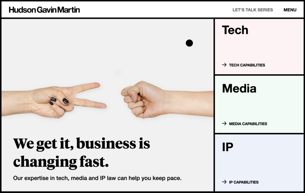
Hudson Garvin Martin’s website is a great example of how geometric grids can be used in web design. The website uses clearly defined blocks for navigational purposes as well as to store content.
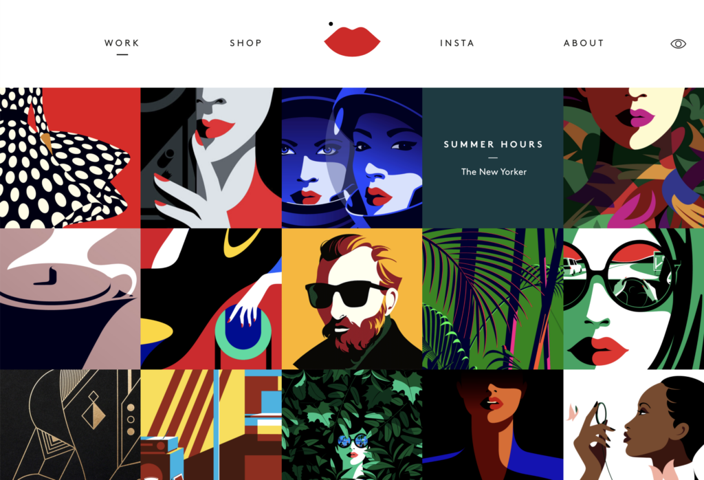
Malika Favre’s website is a perfect combination of bold and minimal art in a grid layout.
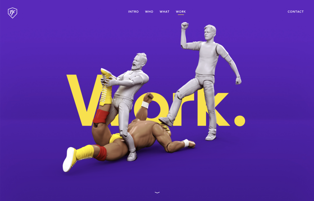
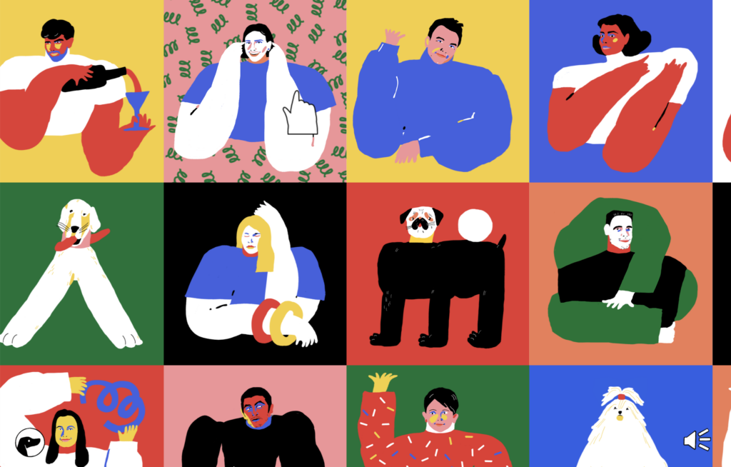
7. Cartoon illustrations
Not so long ago, websites were just about text and graphics. However, since then things significantly changed for the better. Web design is now increasingly about establishing a connection and engaging with website visitors. One of the ways to do so is by including cartoon illustrations in the web design.
A website that makes the process of browsing through it fun is Toy Fight. The website illustrates two characters who keep fighting throughout the entire website. Each page shows the same characters in different poses.
Another example of a website that has creatively used cartoon illustrations is Tubik Studio. Instead of using photographs of its team members, it has used cartoon illustrations for each member.
8. Scrolling transformations
When users visit a website, they’re doing more than simply scrolling – they’re interacting with the interface. Now that present-day designers are keen to turn all types of interactions into memorable experiences, the scrolling transformation has emerged as a trend.
Scrolling transformations can range from full-color scheme variations to complex animated layout transitions. It’s natural that eyes get attracted to movement – hence when unexpected changes happen as users scroll, it will keep them engaged.
Here’s an amazing example of scrolling transformation designed by Vilius Vaicius. The web design provides users with a new experience every time they scroll, making it a truly amazing experience.
Outer Studio uses an eye-catching array of scrolling cards and seemingly non-moving artistic images and forms.
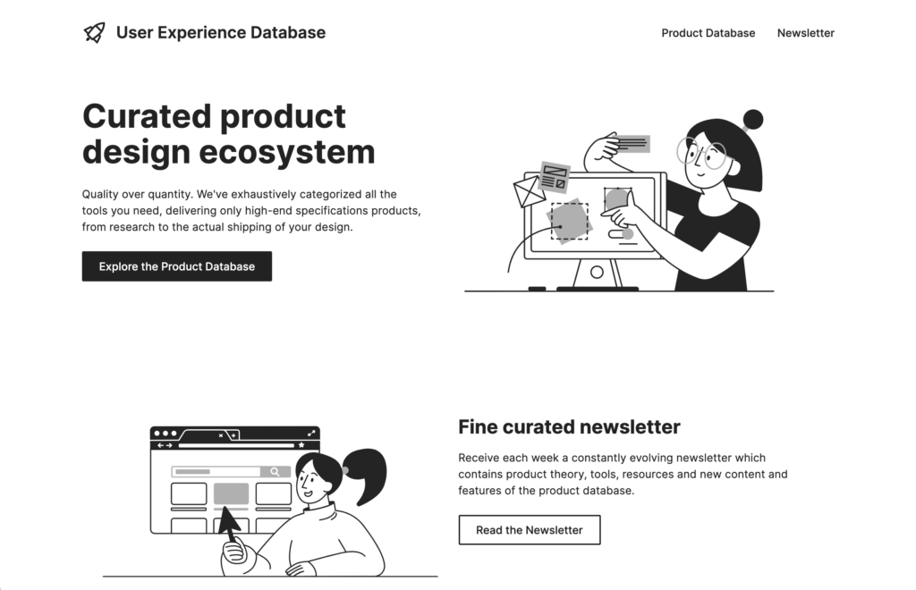
9. Colorless design
Lots of white space and keeping most elements black or gray makes for a clean design. Any colorful element placed in a colorless design gets special attention. Plus, a colorless design can speed up your design process as you spend no time choosing the “right” colors.
In the example below, User Experience Database chose a colorless design that is minimal and easy to read.
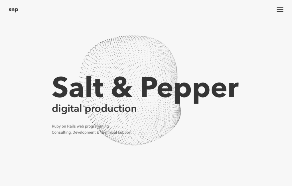
The digital production company Salt & Pepper minimized their color selection to black and white, with some light gray. Images are the only colorful elements of the website.
Don’t be afraid to go colorless in 2021 with your own design work!
10. Gaussian blur
Blurry backgrounds have become a popular design choice for websites – gaussian blur being the most often used. The style has a calming effect and provides an elegant appeal.
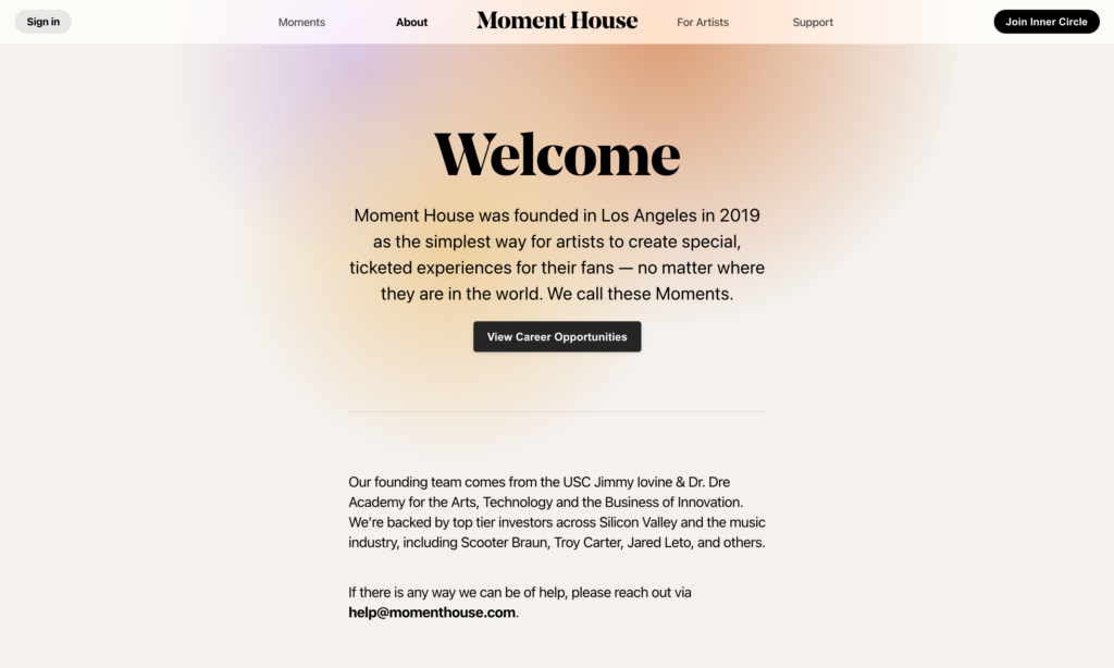
Moment House places a delightful gaussian blur of color at the top of their website.
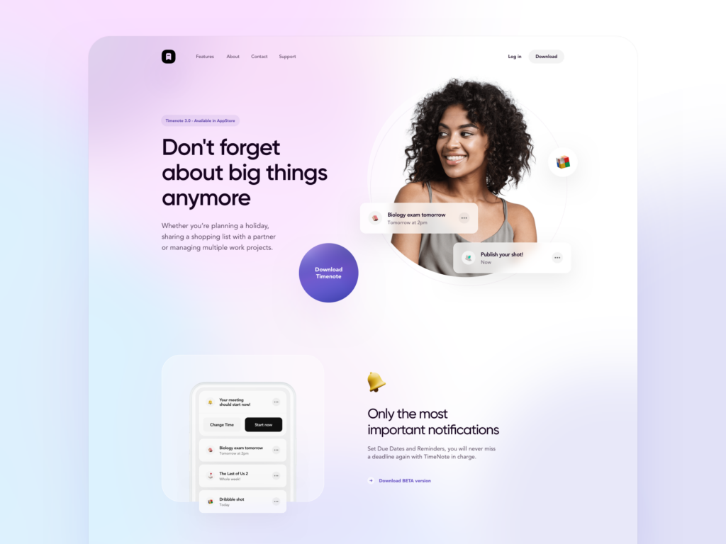
TimeNote 3.0 also uses the gaussian blur effect to draw user attention to the text by underlying it with a light splash of color.
Let’s embrace these design trends
We’ve covered the 10 top web design trends for 2021. Now it’s your turn to embrace these trends and build a website that can help your brand stand out.
We can’t wait to see all the websites that will emerge following these trends.