Kategorien
Uncategorized

How to Build Habit-Forming Products and Services

It’s a fact that we spend a staggering 40% of our day doing things without thinking about them. Instead, we follow learned behaviors: how we respond to people; how we react to certain emotions; when and how we move, eat, and drink. These automatic behaviors are also known as habits.

“We are what we repeatedly do.
Excellence, then, is not an act, but a habit.” 

– Will Durant, The Story of Philosophy

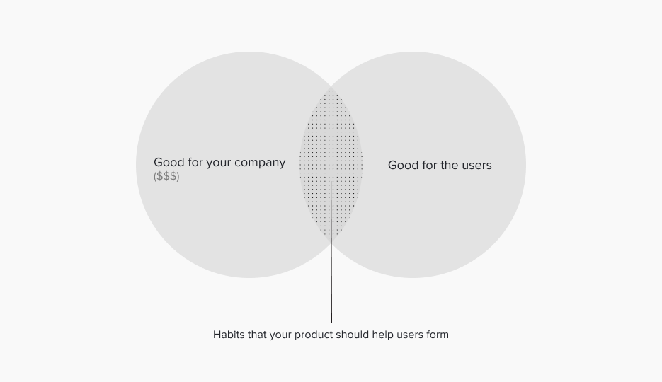
Digital products have the power to form habits. Companies that can create customer habits through their products gain a significant competitive advantage, because products and services weaved into customers’ automatic behaviors are less susceptible to attacks from other companies. But how can companies create products that people use every day? What are the secrets of building highly engaging services?

What are habits?

Let’s start with habits. Researchers define a habit as an “automatic behavior triggered by situational cues.” Simply put, habits are activities triggered by something and done with little or no conscious thought.

We all know that there are good and bad habits. Negative habits are often considered unhealthy, unproductive, or even dangerous. This includes eating unhealthily, compulsively scrolling through social media for hours, or smoking cigarettes. On the contrary, activities such as exercising, reading books, and drinking lots of water are considered positive habits.

Habits aren’t built overnight. Research has shown that it takes 18 to 254 days to form a new habit.

Digital products have the power to build and break habits, both good and bad. Let’s discover how it’s done.

The Hook Model

The Hook Model is a 4-phase process developed by behavioral economist and entrepreneur Nir Eyal. Companies can use it to create habit-forming products and services.

The goal is to generate voluntary, high-frequency user engagement. At its core, the Hook Model is about creating a customer habit. This is achieved by connecting a user’s problem to a company’s solution with enough frequency to make the engagement an ongoing practice.

The creation of habitual behaviors via a looping cycle can be divided into 4 steps: Trigger, Action, Variable Reward, and Investment. Breaking it down can help us to understand how habits are formed and how we can build habit-forming products.
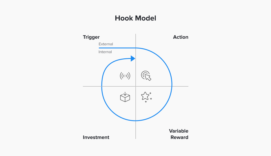
The 4 stages of the Hook Model: Trigger, Action, Variable Reward, Investment

1. Trigger

First, there’s the trigger. An external trigger contains some information that lets you anticipate a reward, thus, causing your brain to innate a behavior. Our ancestors looked for cues that signaled the location of rewards such as food, water, and shelter. Nowadays, we’re constantly analyzing our environment for indications that promise money, fame, power, status, recognition, or personal satisfaction.

Triggers come in two types – external and internal.

External triggers are sensory stimuli from the physical environment. These can be something you hear, see, smell, taste, or feel.

Internal triggers are learned associations about what to do when having a thought or an emotion.

Product designers can employ external triggers such as call-to-action buttons on a web page, push notifications on smartphones, or emails with a link to drive users to engage with digital products. External triggers do not have to be software-based only. Research has shown that wearable activity trackers can act as a powerful external cue by reminding users to exercise.

Many popular digital products use external triggers to remind users to perform a behavior. Calm, a meditation smartphone app, increased retention threefold by showing users a daily reminder on their smartphones. Duolingo, a language learning app, sends out daily reminders via email to remind users to keep practicing. Gina Gotthilf, VP of Growth and Marketing at Duolingo, said: “Emails and notifications have been extremely effective in bringing people back.”

To build habit-forming products, product designers need to discover which internal trigger they can tie to a desired action. Then they need to figure out how to initiate the habit loop by using external triggers that drive users to the action.

For example, boredom is often associated with an action on a digital product. Just think about how often you check your email inbox or Instagram out of sheer boredom.

2. Action

After the trigger comes the action. The action is the behavior made in anticipation of the arrival of a reward.

But not every trigger ends in action. Dr. B. J. Fogg at Stanford University has a model that describes in a simple manner what drives our actions. For any action to occur, 3 criteria must all be present at the same time:

  1. The user must have sufficient motivation
  2. The user must have the ability to complete the desired action
  3. There must be a noticeable trigger
Dr. B.J. Fogg’s Behavior Model: Only when motivation, ability, and a trigger are present simultaneously and in sufficient degrees will a behavior occur

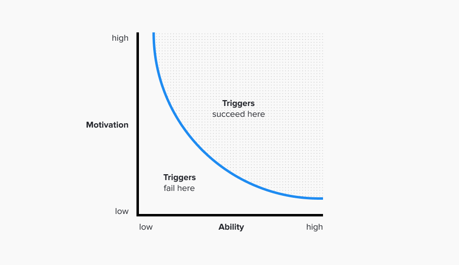
Let’s walk through two examples to explain the model.

Your phone rings, but you don’t pick it up because at least one of the following factors is present:

Low Motivation: You see that the call is from a call center. Therefore, you decide not to answer.
Low Ability: You hear the phone ringing but are in the shower and can’t pick it up.
Lacking Trigger: Your phone was on mute, so you didn’t hear it.

An app that tracks and analyzes running activities has a promotion for its monthly subscription fee. However, you don’t subscribe because at least one of the following factors is present:

Low Motivation: You’re not a runner. Therefore, you’re not interested in getting the subscription – even for free.
Low Ability: It still costs more money than you can spend. Your financial ability is limited.
Lacking Trigger: You can’t find the button to subscribe and profit from the promotion.
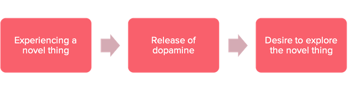
3. Variable Reward

A reward helps a person’s brain figure out if a particular loop is worth remembering. While the neurotransmitter dopamine surges in anticipation of a reward, introducing variability multiplies the effect, increases focus, and suppresses areas of the brain associated with judgment and reason. That’s why it’s more entertaining to spend an hour on a slot machine than work for an hour at a set wage.

As a product designer, give users what they came for. But leave them wanting more so they keep coming back to your product. To leave them wanting more, introduce an element of mystery about what they might find the next time they engage.

For apps with a content feed, make sure there’s some fresh content each time a user comes back. Successful products, whether Instagram, LinkedIn, or Pinterest, all make use of the variable rewards technique. Every time you open one of these apps, the content varies, and there’s no way you can anticipate what you’ll see.

4. Investment

In the last step of the loop, the user does some work. This investment can occur in many forms, such as time, data, effort, social capital, or money. Whenever a user invests in a product or service, the odds for another pass in the cycle increase in two ways.

First, an investment loads the next trigger to start the cycle all over again. For example, writing a message (investment) on WhatsApp makes it more likely to get a reply in the future (external trigger). An image posted on Instagram (investment) usually gets a few likes, a piece of information the app will deliver to the user via push notifications (external trigger).

Second, investments store value, which means that a product improves with use, increasing the likelihood of users returning. Such stored value can be content, data, followers, reputation, or skill. For example, on LinkedIn, users‘ online curriculum vitae (CV) embodies the concept of stored value. The company found that the more information users add to their online CV, the more likely they’ll return. There’s another benefit of stored value in your product. As the invested value is usually not transferable to another solution, users will also be less likely to switch to a competitor’s solution.

A powerful tool

In summary, an external or internal trigger elicits an action, which provides a reward. Then follows the investment phase, which lets users set themselves up for future triggers. Over time this learned sequence forms a neurological loop that becomes stronger with every additional cycle.

The Hook Model helps product designers create habit-forming products. It can also be used to uncover weaknesses in existing products which failed to form habits.

Use it for good

With great power comes great responsibility. As seen above, habit design is a superpower and should be used cautiously. If used for good, it allows product designers, entrepreneurs, and innovators to build habit-forming products that improve users‘ lives. If misused to exploit, companies use it to build habits that can turn into wasteful or even dangerous addictions.

Kategorien
Uncategorized

6 Lessons from Designing a Wizard

We recently worked with eduwo, a startup in the growing EdTech sector. We helped them design a wizard that helps users find their ideal education program.

Hold on, what’s EdTech?

Technology has long been an essential part of education, from the ancient abacus to pocket calculators, from overhead projectors and whiteboards to modern projectors and e-learning. These tools help people learn in simpler, faster, more effective, and cost-efficient ways.

„Education is the most powerful weapon which you can use to change the world“

– Nelson Mandela

Nowadays, education technology (EdTech) is an umbrella term covering not only online learning, but a whole suite of digital services and products that help facilitate learning. In other words, EdTech includes all software, hardware, and tools such as online learning applications, curriculum management software, digital textbooks, communications, and administration platforms for students, teachers, and parents.

OK, so what’s a wizard?

When it comes to inputting data in web and mobile applications, the two most common user experience (UX) patterns are forms and wizards. Wizards can be considered mini-applications that guide users through a sequence of forms that they need to complete to accomplish a goal. As the Nielsen Norman Group puts it, „A wizard is a step-by-step process that allows users to input information in a prescribed order and in which subsequent steps may depend on information entered in previous ones.“

A wizard is a step-by-step process that allows users to input information

Now, what’s the eduwo education finder?

Eduwo’s education finder helps users identify the education program best-suited to their needs. After completing the wizard, the system makes intelligent recommendations based on their educational and professional experiences, needs, and preferences. Think of it as a digital school counselor that asks you specific questions to find your ideal education options.

Here’s a quick peek at some of our work, plus 6 important lessons this project taught us along the way.

1. Make the purpose of the wizard clear

If users don’t understand the purpose of a user interface (such as a wizard) right away, they’ll quickly leave. Therefore, we ensured that users easily comprehend the overall purpose of the education finder. We added the wizard’s title to the navigation panel, which stays there during the entire wizard. Additionally, users see a personal greeting at the beginning of the wizard, as well as the wizard’s purpose.

Making the purpose of a wizard clear right from the beginning

Once a user has begun the wizard, it’s crucial to keep them engaged by making every step clear. Therefore, we placed a concise title at the top of every step.

Each step has a concise title to make its purpose clear

2. Logical order of the steps

A wizard consists of multiple steps. By completing a step, a user reaches the next step. As part of designing a wizard, you need to define the optimal step order.

In some cases, the user inputs logically depend on each other, limiting the degree of freedom in which the steps can be ordered. In our case, the user inputs did not have many dependencies and, therefore, could be freely arranged to a large extent. We structured the steps according to two principles.

The first principle was to start with easy questions and slowly progress towards questions requiring more time to answer due to additional selection options, or because users have to think about their needs and desires. The wizard starts by asking for their birth year – nothing users have to think hard about – and moves on to questions about the fields they would like to study. Once users invest some time answering several easy questions, they are less likely to abandon the wizard midway and are more likely to keep going due to the sunk cost bias.

The second principle was to structure questions chronologically along people’s mental timelines. The wizard starts by asking questions about a person’s past, such as the already mentioned birth year, as well as previous qualifications and work experience. It then continues by asking what they are currently doing, such as requesting them to enter their current job title. After that, the wizard wants to learn about their future, such as which field they would like to study, their budget, and ideal start date.

3. Explain why you’re asking for the information

A variety of personal information is required to determine each person’s most suitable education options. However, users are (rightly) cautious about sharing such information, especially on the internet.

Explaining the reason why you’re asking for specific information, especially if there’s a benefit for the user by sharing it, establishes trust and increases their willingness to provide personal details.

4. Keep the cognitive load low

Dividing the inputs and placing them in individual steps, and displaying only the most relevant elements, keeps the user interface light and doesn’t seem overwhelming. However, this segmentation increases the number of wizard steps. Users perceive a wizard with many steps as tedious and time-consuming, causing them to abandon it at the beginning or midway when they lack the feeling of making real progress. There’s a fine line between not overdoing individual steps and, at the same time, keeping the number as low as possible. As an overall goal, we tried to keep the wizard at a maximum of 10 steps and only focus on the most critical questions.

To keep the cognitive load low, each step only contains one question and essential elements.

5. Don’t design in isolation

When the task at hand is to design a wizard, you obviously need a UI/UX designer. Involving other specialists is less obvious and therefore often gets neglected. Which leaves a lot of potential off the table.

Teaming up with various experts brought the education finder design to the next level. It also prevented issues that the development team would have encountered later when implementing the design.

Interviewing potential users to understand how they make decisions when choosing education programs, and where current solutions‘ pain points are, led to valuable insights. We used these in the ideation process and later involved potential users again to get feedback on our ideas, with the intent to refine the wizard’s design.

Eduwo’s engineers were involved early on to let us know about all available data that can be used in the wizard. If you omit involving engineers, you risk designing an interface that can’t be implemented because the necessary data is not available at all or not in the form you need for the interface. Moreover, you might even miss an opportunity because you don’t know about some valuable data you could use to build a better wizard.

A UX writer improved the microcopy of the wizard by using words that keep users engaged and verbally guide them through each step of the education finder. They made these changes at the wireframe stage, where it is relatively cheap compared to later stages.

Viewing the product owner not only as a project sponsor but actively involving him proved to be extremely valuable. In addition to informing us about the project’s goals, he shared deep knowledge about the users‘ needs.

6. Invest in a pattern library

Specifically for the education finder, we designed a pattern library with reusable components and interactions, such as buttons, input fields, and navigation elements.

Creating a pattern library costs time and money. But it’s a worthwhile investment: it accelerates the overall design process and subsequent development. A pattern library not only ultimately saves time, but also ensures a consistent user interface, which improves the user experience and makes a product look more professional. Moreover, the created pattern library can be reused later to build further wizards.

In an ideal world, you would create a pattern library before starting the wizard’s design. But the more natural way to create a pattern library is to start with the wizard design and build the library as you go. Whenever you can’t build an interface with existing library elements, you add or extend the required components to the library.

Wrapping up

Here’s a summary of the 6 takeaways from designing the education finder:

  1. Ensure that users understand the wizard’s purpose as a whole and its individual steps. Users will abandon the wizard if they don’t understand what they get in return for completing it.
  2. Present wizard steps in an order that makes sense for users. Don’t cognitively overwhelm them by starting with hard questions.
  3. People are cautious about sharing personal information – explain why you ask for it and what’s in it for them if they provide the information.
  4. Don’t overload the wizard’s steps; keep the number below 10.
  5. Gather a team of experts — UX/UI designers, potential users, engineers, UX writers, product owners — and you’ll be better equipped to deliver a great product experience.
  6. Invest in a pattern library — the returns will be manifold
Kategorien
Uncategorized

How Can Design Thinking Help the Finance Sector Keep Up with Modern Times?

The finance sector has gone through considerable change in recent years. What was once a privilege of the wealthy is now accessible to everyone. Financial services are available anywhere and anytime thanks to technology and mobile phones. But what does this mean for the industry, and how will financial services keep up?

Design thinking is a methodology that allows individuals and teams to work together in solving problems and creating solutions. Design thinking can be applied to almost any aspect of business, including finance sector processes. The finance sector needs design thinking now more than ever as it faces a future of disruption, changing customer desires, and pressure to innovate.

What exactly is design thinking, and how can it be applied to finance sector problems?

Design thinking is a problem-solving methodology that starts with the customer. Design thinking considers the user’s needs and wants, as well as the company’s business goals. It is a human-centered approach that allows for creativity and collaboration. Scholars and experts in the field of design thinking have identified five stages that are essential to the process:

1. Empathize with the user
Here, the user is put at the center of all decisions and problems. Design thinking begins with empathy for the user, whether it is a retail customer or a corporate client.

2. Define the problem
This step is about understanding and articulating the problem. Design thinkers will ask lots of questions to get a clear understanding of the problem.

3. Ideate potential solutions
Design thinkers are encouraged to brainstorm as many solutions as possible. This is the time for imagination and creativity.

4. Prototype your solutions
You can use frugal methods such as pen and paper sketches or digital methods to create prototypes. Prototyping allows you to see your solutions come to life and get feedback from others.

5. Test your prototypes
This is where you put your solutions to the test. You can test them with users or with a smaller group of people within the company. Design thinkers constantly iterate and test their solutions until they find one that works best for the customer and the business.

The finance industry is not known for being the most innovative industry. Banks are known for being slow to adapt and change. But the world is changing fast, and the finance sector needs to keep up. Design thinking can help the finance sector face the future with confidence and adapt to the needs of customers. Here are three potential ways design thinking can help this industry:

1. Banking and financial services

Design thinking can help banks and other financial institutions design better products and services that meet customers‘ needs. It can also help with customer service and support, helping to resolve complaints and improve satisfaction levels.

The industry is already under pressure to change and adapt to new technologies and customer needs. With financial technology (fintech) startups disrupting the industry, finance sector incumbents are under pressure to innovate. Design thinking can help companies adapt to changing customer needs and embrace new technologies. Design thinking can also help employees in the finance sector formulate innovative solutions to old problems.

For example, think about how mobile banking has changed the way people bank. It has made banking more convenient and accessible to people worldwide. But customers‘ needs and wants are constantly evolving, so banks need to continue to innovate to stay ahead of the curve. Design thinking can help them do this. With the metaverse becoming more popular, for instance, is it likely that customers will want more virtual experiences from their banks? Metaverse is a term for a digital world composed of multiple virtual universes. In this digital world, people can create their own online persona or avatar and interact with others in various ways. Financial institutions could use design thinking to develop products and services that cater to the needs of metaverse users. Design thinking is about anticipating needs and wants, not just meeting them.

JP Morgan’s Onyx Lounge In Decantraland. Image: Decentraland

2. Design thinking for financial advisors and brokers

Design thinking can help financial advisors, and brokers better understand their clients‘ needs. The finance sector is full of jargon that many people do not understand. Design thinking can help simplify the language used to explain investments, taxes, insurance policies, and other products or services offered by these professionals.

An example of how an independent financial advisor (IFA) can use design thinking is to help clients make better financial decisions. For example, imagine that a client wants to invest in a mutual fund but doesn’t know which one to choose. An advisor using design thinking would ask questions like, „What are your goals for this investment? How long do you want to invest?“ Design thinking can help advisors understand their clients‘ needs and find a way to meet them. It can transform an IFA from a salesperson into a trusted advisor.

3. Blockchain Applications

Design thinking can help blockchain startups better understand their customers and come up with innovative solutions to problems. Blockchain is a new technology that can revolutionize the finance sector. It is a digital ledger of transactions that can be used to record anything of value, from money to property deeds.

When it comes to blockchain, design thinking is all about collaboration. Designers and developers need to work together to develop creative solutions that meet the needs of customers. For instance, imagine using blockchain to record property deeds. Designers might work with developers to design an app that would allow people to transfer their property ownership without going through the hassle of dealing with a lawyer or real estate agent.

In a recent Forbes article titled, “The Future Of Real Estate Transactions On The Blockchain,“ Adam Redolfi describes how blockchain can disrupt the real estate industry in unprecedented ways.

“If the internet has revolutionized the commercial sector in recent years through the development of marketplaces, the blockchain stands to change the real estate sector in terms of fluidity and distribution of information and transactions” he wrote. “As the blockchain could shake up entire sectors of our global economy, all real estate professions are now concerned with the blockchain, from recording and funding to transactions, from real estate investment to appraisals to asset management.”

The finance sector as we know it is facing an uncertain future. In his book, „Bank 4.0: Banking Everywhere, Never at a Bank,“ Brett King argues that banks will be obsolete if they don’t embrace new technologies such as mobile banking, artificial intelligence (AI), and blockchain.

„The emergence of Bank 4.0 means that either your bank is embedded in the world of your customers, or it isn’t. It means that your bank adapts to this connected world, removing friction and enabling utility, or it becomes a victim of that change,“ he writes.

„The bankers of tomorrow are not bankers at all—the bankers of tomorrow are technologists who enable banking experiences your customers will use across the digital landscape. The bankers of today, the bank artifacts of today, the bank products of today, are all on borrowed time,“ he adds.

Kategorien
Uncategorized

Product Opportunity Assessment

When it comes to product discovery and figuring out what products to build, there are a set of techniques we apply.

The first step of the product discovery phase is to frame it. A simple discovery framing technique that saves you time and money by avoiding weak opportunities is the Product Opportunity Assessment. For opportunities that turn out to be lucrative, this technique helps to clearly determine what is required in order for implementation to be successful.

The Product Opportunity Assessment also ensures alignment and clarity of purpose among the team and other stakeholders.

The Product Opportunity Assessment addresses 4 key questions about the project you’re about to undertake:

  1. What business objective does the solution intend to address? (Business Objective)
  2. How do we measure the success of the project? (Key Results)
  3. What problem will we solve for the customer? (Customer Problem)
  4. For whom do we solve that problem? (Target Customer)

Business Objective

To start the conversation, ask yourself or your team: Why are we doing this project? This discussion can take anywhere from 1 minute to multiple days. There’s a risk of skipping this question because you assume the objective for a new project is clear for everyone. However, it’s crucial to have this discussion to ensure all stakeholders are on the same page regarding the overarching goal.

The business goal is usually of a qualitative nature. It should be ambitious and aggressive, yet realistic. Thus, it should inspire and set the direction.

For example, a business objective could be to grow the customer base, or to improve the customer experience.

Key Results

At the start of each product discovery phase, we want to know the exact measure of success. For example, if the business objective is to improve the customer experience, a possible key result is to reduce the average customer onboarding time to under 3 minutes.

A key result should be a measurable outcome, consisting of a metric with a target value. When reached, it moves the company closer to a business objective.

Customer Problem

While the first two questions address the company’s goals and how an initiative benefits the company, we want to focus on the customer in the second step. We must identify the problem that customers are facing so we can attempt to solve it. A problem can come from using the current solution, a competitor’s solution, or exist because there is no adequate solution on the market yet.

The question about the customer problem is usually the hardest to answer, which surprises people because it sounds like the easiest. However, when you ask startup founders or product managers what problem their product intends to solve for customers, often all you get is a list of features.

A possible problem could be that it takes a company a lot of time to pay all its remote workers with a contractual agreement and maintain a clear overview of these payments.

Target Customer

The question „For whom do we solve that problem?“ intends to define the target customer who will benefit from the solution to a problem. A commonly used tool to determine the target customer is the creation of user personas. 

Often the initial target group is too large. Whenever the target group is everyone, it’s necessary to narrow your niche. A product created for everyone serves no one. Niching down is especially essential for startups. Underserved sub-niches tend to have less competition, as large brands consider the smaller markets not worth targeting.

A possible target customer could be a front desk employee at a 4-star hotel in Switzerland. If you want to niche it down further, you could consider only hotels in ski resorts.

Focus on the objective and the problem

Depending on the project, there are other factors to consider. However, these are the bare minimum questions we address when starting the product discovery phase. As you can see, the purpose of a Product Opportunity Assessment is to identify the business objective and the customer problem, not the solution.

The result of the Product Opportunity Assessment will be discussed with the client or senior management. It will then be used to make a go or no-go decision to proceed with the project.

A Product Opportunity Assessment will inform you what you’re getting yourself into and what it will take to succeed if the project goes ahead. We also ensure that all team members know the answers to these questions before jumping into the product discovery phase.

Kategorien
Uncategorized

What Is a Wireframe? A Step-by-Step Guide to UX Wireframing

One of the first steps of designing a website, web application, or mobile application is to create wireframes. Wireframes provide you and your team insight into the high-level layout, structure, and functionality of an application. Wireframes also visualize how users interact with an interface and navigate through it.

In this article, we’ll cover the following:

  • What are wireframes?
  • Why do you need them?
  • How do you create wireframes?

What are wireframes?

Before we take a deep-dive into how to create wireframes, let’s first get clear on what wireframes are and why they’re so valuable.

A set of wireframes is a visual blueprint of how a user interface of your application will work. Before you invest time and money in actually coding your application or creating a high-fidelity user interface (UI) design, it’s a wise idea to get those wireframes finalized.

Creating wireframes involves defining the key elements of your product. Wireframes should include the key copy, buttons, calls-to-action, input fields, and navigation. Furthermore, you should also define error messages, dropdown options, etc.

Let’s take an online banking app, for example. If you’re wireframing a feature that allows users to make payments, you’d define elements such as inputs of the payment’s recipient, payment reference, amount or currency. Also, you’d include the navigation and the buttons to submit and cancel the transaction.

Example of a wireframe for an online banking app

On the transactions overview screen, where all past and open transactions are displayed, you’d design the filtering and sorting functionality. You wouldn’t just scribble a box that said, „some filters.“ You’d define which type of filters exist and by which attributes users could sort transactions.

Not a very helpful wireframe
The same screen, but now more detailed and more useful

You can create wireframes with different levels of fidelity. It’s important to remember that wireframing is where you figure out what goes into each screen and how the different screens connect.

Benefits of wireframes

Wireframes are extremely useful. Design changes on screens can be made quicker and with less effort than if you made them later in the design and implementation process of the product. Therefore, wireframes are a perfect tool to go through many iterations of your product, fast.

Wireframes are also ideal to test your product idea with potential users. Instead of trying to explain how your product will look, you can show wireframes to test users as a first prototype and collect feedback.

Wireframes are also a perfect communication tool. Everyone on a team — developers, clients, designers, businesspeople, etc. — can understand them.

Well-designed wireframes can replace multipage documents with convoluted design specs. Such documents often resemble complicated essay papers — which engineers hate to read as much as designers, requirements engineers, and business analysts hate to create.

Don’t make them pretty

When wireframing, beauty isn’t important. Don’t fuss over how the wireframes look. Focus on the usability-aspects by making them clear and clean. Forget about typography, colors, and well-chosen images. Spending hours upon hours prettifying and making the interface pixel-perfect at this point is a waste of time. You’ll go over many iterations and redo many parts. Besides, if you spend a lot of time on the initial version of your wireframes, you’ll be less willing to make changes even if the feedback from test users suggests that you ought to make adjustments.

Also, test users will be less willing to provide critical feedback about the general concepts of a prototype if it looks close to a finished product. They’ll focus too much on the visual aspects of the design instead of its usability.

This is a visual design, not a wireframe. When wireframing, you should not focus on things such as colors, typography, or images to make the screens pretty.

When to create wireframes

If you choose to build your product according to an agile development methodology, you’ll typically have to create the key wireframes as part of your initial solution design and then extend them in the process of building your product. If you follow a “waterfall” development methodology (usually completely maladapted for today’s rapidly changing business environments), you’ll have to create wireframes for all screens, as part of the product specification, before the software implementation starts.

How to create wireframes

Wireframes can be created quickly and easily. You don’t need to be an artist or an experienced UI (user interface) designer to draw the basic wireframes of your product idea. You just need to be able to draw boxes, circles, and arrows.

To get started, you’ll just need some paper and a pen. If you’re wireframing with group of people, a whiteboard can be useful but isn’t required. If you want to get fancy, you can use an iPad with an Apple Pencil and a sketching app like Concepts.

A sketching app such as Concepts can be used to draw wireframes (Source: Concepts)

Some people may feel the urge to start wireframing with a design application, like Balsamiq or Figma. However, I highly suggest starting off the wireframing process with pen and paper (or whiteboard). There are a number of reasons for this, and they’ll become clear in the course of this article.

Step 1: Create a sitemap

The wireframing process starts with creating a sitemap. A sitemap shows all the screens of an application and how these screens interconnect. For each screen that your application should include, draw a box with the name of the screen in it. Typically, the first screen is the „Home Screen“. Next, draw the remaining screens. By drawing lines between screens, you define how the screens interconnect, thus how users navigate through the application. If some of the screens of your application should be made accessible to logged-in users alone, you can indicate that by adding a lock symbol to the screen.

A basic sitemap of an online banking app

Step 2: Sketch wireframes

Once you have the overall structure of your application defined on a sitemap, it’s time to draw the wireframes of the individual screens. If you haven’t wireframed before, don’t fret. The process is simple! Each element of the application is represented with a simple shape, such as:

  • Large boxes, for containers and sections
  • Small boxes with text, for buttons
  • Multiple horizontal lines, for long paragraphs (titles and important copy should be written out)
  • Boxes with diagonal lines through them, for images

Two key elements you shouldn’t forget are headers and navigation.

In case you’re creating a web application or website that should be optimized for mobile devices, you should at least wireframe the key screens for mobile devices.

Wireframe of a page for a banking website, including the version for smartphones

Step 3: Draw interactions

After you’ve sketched the wireframes for all screens, draw arrows between screens to indicate how users will navigate through the application. Use the information from the sitemap where you already specified how the screens interconnect. Typically, users get to other screens by clicking or tapping on buttons. Therefore, arrows often lead from buttons to screens.

Wireframes of a rideshare app; arrows indicate how to navigate through the app

Ensure that users are well-guided through the user interface. Users must be able to reach each screen. Avoid dead-ends — situations whereby users can’t return to the previous screen.

A dead-end — users can’t return to the previous screen

Step 4: Digitalize wireframes

Now that our paper-and-pen wireframes are done, it’s time to convert them into a digital version. Paper wireframes are great to brainstorm first drafts and quickly iterate through different versions at the beginning of a design process. But they have some drawbacks. They are more difficult to store, share, and make interactive than digital versions of wireframes. However, don’t get fooled and rush into a digital version as your first step. Digital wireframes take longer to create, take more time to edit, and it’s all too easy to fall into the trap of spending too much time on the details of a screen.

For basic, low-fidelity wireframes, we often use Balsamiq at Voa Labs. Balsamiq doesn’t allow you to create detailed visual designs, which is ideal when the goal is to create low-fidelity wireframes. Other tools that are also great for creating wireframes, but which also allow for greater detail (which can be a drawback), include Sketch, Adobe XD or Figma.

Step 5: Create an interactive prototype [optional]

„An interactive wireframe is the best trade-off of speed for functionality because it allows for natural exploration and discovery on the part of the subject without requiring a fully working product.“

– Laura Klein, Principal at Users Know

Many wireframing tools allow you to make wireframes interactive. You interlink screens by defining the target screens of buttons and links. The resulting interactive prototypes are great for early user-testing. You can ask test users to navigate through the application and share their feedback.

An interactive prototype of a rideshare app

What’s next?

After following the steps above, you’ll have created your wireframes, maybe even used them to create an interactive prototype, and integrated user feedback. Typically, the next step is to create a high-fidelity visual design. Here, you’ll work on the combination of typography, colors, and imagery — all with the goal of creating a visual design that delights users aesthetically.

Kategorien
Uncategorized

The importance of lifelong learning is increasing, according to the co-founder of eduwo

If you have ever thought about getting an education or continuing education, you are well aware of the many options. It is hard to get an overview, let alone being able to compare the different study programs and courses offered by universities and schools. That’s why Benjamin Vidas, now COO, and his co-founders decided to solve this problem by building eduwo – a platform that offers an overview of educational programs and guides people toward their ideal degree and profession.

After working with Benjamin and his team on the design of eduwo, we can confirm that this platform is definitely one you’ll want to check out whenever you’re thinking about getting an education. We got the chance to ask Benjamin about his vision, the things he’s learned the hard way, and the future of the Swiss education system.

On eduwo

What inspired you to start eduwo?

Fortunately, Switzerland has a diverse range of educational and professional opportunities. However, the large variety of choices can also be overwhelming. We founded eduwo so that everyone can find the right education for themselves.

Graphical user interface, application, chat or text message

Description automatically generated
On eduwo you find a ranking of programs and courses offered by Swiss universities and schools.

What advantages does eduwo offer over other career counseling services?

The advantage of eduwo is that users not only receive all the information about the schools and study programs, but can also benefit from the experiences of current and former students. Further, we connect between people looking for education, and schools or potential employers.

In addition, we have recently launched a brand new and innovative comparison function that allows direct comparison between various continuing education programs in a very user-friendly way.


What does success mean for eduwo? How do you measure it?

We are successful when our users – potential students and schools – are satisfied. We measure this by the number of users and the average time spent on our website. Most important, however, are the matches between users and providers – for example when information material gets ordered or a consulting meeting is requested.


Can you tell us about your revenue model?

Schools pay for a premium presence on eduwo – either a flat rate or per referral of potential students.

Graphical user interface, application

Description automatically generated
eduwo provides detailed information about study programs and courses including user-generated reviews.

How will the Swiss education system shift in the future?

I think that in the future everything will become more digital and much will take place over distance learning. This trend certainly got accelerated by the Coronavirus crisis.

Even schools that aren’t well-known yet will be more and more in demand, and the skills like programming and an understanding of IT will be increasingly at the forefront.

The importance of lifelong learning is also increasing. More and more people are frequently taking smaller and more specific courses, even later in life.

Furthermore, interdisciplinarity, the cooperation of different disciplines – for example artificial intelligence with marketing – is becoming very significant.

On leadership & strategy

What were the best decisions and where would you adjust certain steps you’ve made along the journey? What are the lessons from them?

My best decision was to start eduwo and to have the experience of building and developing the company. Certainly, there is always a risk of losing focus. Further, it is important to regularly assure that you spend the money on the right priorities.


Nowadays, there is a great number of advice and support opportunities for Swiss startups. How do you know which advice to follow and which to ignore?

I think it’s always important to get a second opinion on any received advice, and to take the time to discuss the inputs on important issues with the team.


This year you extended the eduwo platform by a feature that allows users to compare courses. What prompted you to do that?

There are thousands of study programs in Switzerland and all of them have different requirements, varying costs, advantages, disadvantages, learning content and study durations. Therefore, it usually takes a lot of time to find the right course. Thanks to this new function, the courses can be compared very quickly and easily, which helps a person a lot.

Graphical user interface, application

Description automatically generated
The recently launched comparison feature allows comparing thousands of Swiss study programs and courses.


How do you prioritize which features to build next?
Our platform always puts the user first and we try to continuously release innovative features for their needs. For example, based on the feedback from HR departments of companies, we will soon extend the new comparison feature so that it is optimized for companies. This way, HR managers can make it available for their employees and optimally propose possible paths for continuing education.

“Our platform always puts the user first and we try to continuously release innovative features for their needs.”


On Technology & Design

What have been the biggest technology challenges you’ve had to overcome? How were you able to master them?

We built the eduwo platform from the ground up. Creating a website from scratch comes with certain struggles. An example: SEO – search engine optimization. If you use WordPress, for example, there are SEO plugins available that allow content optimization on a website in order to rank higher on search engines quite easily. This does not exist when you build everything from the ground up. But of course, there are advantages or reasons that speak for programming it from scratch.


What would be your best technology-related advice to other startups?

Use well-known and established programming languages, keep it lean and start with a MVP! Furthermore, communication among the IT-developers, and between the business and the developers, is enormously important.

“Use well-known and established programming languages, keep it lean and start with a MVP!”


What were the biggest benefits to collaborate with Voa Labs?

One of the biggest benefits was to gain a professional outside perspective on the new comparison function. Also, to benefit from their top-notch design and UX skills which we don’t have internally. Another huge advantage was the fast and flexible implementation with agile feedback rounds.

For further information about eduwo and the comparison feature we designed together, read the case study.

Kategorien
Uncategorized

Top 10 Web Design Trends for 2021

Here’s a fact – there are around 200 million active websites. To stand out from the crowd and grab your target audience’s attention, you need a website that is easy to use, aesthetically designed, and provides your visitors with relevant information. More importantly, your website should be able to convey your company’s story interactively.

Now that you understand the importance of attractive web designs, you’re now able to start thinking about how to design a website that fulfills the above-mentioned criteria. Exploring the ongoing trends in the web design industry can help you get inspired and build a website that draws in visitors and stands out among your competitive landscape.

1. 3D visuals

Here are a few reasons why 3D elements are currently so popular in the web design industry – compared to 2D elements, they are often more attention-grabbing and engaging. The realistic look of 3D creates a sense of physical presence that is very natural to the human eye. The futuristic appeal of 3D visuals in web design can boost interest and the overall impression of your brand.

One of the best examples to illustrate this is Campo Alle Comete. The website, designed to advertise an Italian wine, shows a floating city in 3D that depicts the brand story while inspiring visitors.

Whaou is another perfect example of how 3D design elements can bring a website to life. The website allows users to create their own recipes by mixing different ingredients in an interactive kitchen.

2. Parallax animation

In the past few years, designers have witnessed a lot of web-based animation trends – a number of them have started to transform the industry. One such trend is parallax animation.

In a nutshell, parallax is the optical illusion that happens when the objects closest to the viewer appear to move faster than objects that are farther away. While we keep seeing the parallax effect in our everyday lives, seeing it on web pages feels both real and surreal.

Here are a few reasons why parallax animation is in this list of web design trends for 2021:

  • It can add a creative touch to an otherwise dull website.
  • It makes moving around a website attractive and hence encourages user engagement for a longer period of time. The more they stay the more likely they are to become customers.

Minh Pham is an amazing example of a web design using parallax animation.

The website, created by Anton Tkachev, uses parallax effects that respond to mouse positions and dashes of depth with 3D elements throughout their website. This is a great example of how parallax animation in combination with 3D elements can make an impressive impression.

3. Dark mode

For decades, web designers used the default background color – white – for websites. Lately, more and more websites and web apps have introduced dark mode: a simple toggle that lets you change the background color to black. Some websites even offer a dark mode only.

“Everyone can relate to being in a room where the lights are turned down and you’ve got this white screen blinding you”

Sameer Samat, Google’s VP of product management for Android and Play

Here are a few reasons why dark mode is trending in the web design industry:

A creatively made dark themed website is Eat Genesis. The website’s homepage shows a few figures along with an option to order food online.

Even the tech giant Apple uses dark themes for some of its web pages, as shown in the example below.

A screenshot of a video game

Description automatically generated with medium confidence

4. Asymmetric layouts

The asymmetric layout trend has been growing since 2019. The idea behind it is that a website should look less blocky as well as less straight-edged. There are various levels of asymmetry in design – from incorporating small asymmetric elements, to more extreme forms.

Asymmetric layouts provide designers with more freedom of design. Moreover, if used correctly, this layout can help to draw the attention of users to a specific area of the website.

A perfect example of an asymmetrical layout is Ryn Davis’s website. The visuals are not in symmetry – rather the opposite, but still looking appealing. The website is designed aesthetically with a few visuals and some text.

Felix Lesouef has divided his website asymmetrically into three parts. This provides his vertically organized website a lot of space for the content column.

5. Neumorphism

Neumorphism – one of the latest trends in the UI industry – is a portmanteau of ‘new’ and ‘skeuomorphism’. Neumorphic elements pretend to extrude from the background. This extruded look can be achieved by using light and shadows around the elements. Unlike Material Design elements, neumorphic elements do not “float”.

Image for post
Source: Michal Malewicz

The „Rent a Vespa Now“ button on this site designed by Sara Salehi is a great example of how neumorphism can elevate a modern and minimalist website.

Another example is how George Tang created a concept landing page with neumorphic style elements.

If you’re looking for a handy generator to create CSS code for neumorphic elements, head over to: https://neumorphism.io

6. Geometric grids

Geometric grids are indispensable when we look to create a website that is clean and harmonious. In simple words, a grid is a structure that comprises a series of lines (vertical and horizontal) that divides a web page into columns or modules.

Geometric grids help to systematically order details and information while looking appealing and synchronized.

Hudson Garvin Martin’s website is a great example of how geometric grids can be used in web design. The website uses clearly defined blocks for navigational purposes as well as to store content.

Malika Favre’s website is a perfect combination of bold and minimal art in a grid layout.

7. Cartoon illustrations

Not so long ago, websites were just about text and graphics. However, since then things significantly changed for the better. Web design is now increasingly about establishing a connection and engaging with website visitors. One of the ways to do so is by including cartoon illustrations in the web design.

A website that makes the process of browsing through it fun is Toy Fight. The website illustrates two characters who keep fighting throughout the entire website. Each page shows the same characters in different poses.

Another example of a website that has creatively used cartoon illustrations is Tubik Studio. Instead of using photographs of its team members, it has used cartoon illustrations for each member.

8. Scrolling transformations

When users visit a website, they’re doing more than simply scrolling – they’re interacting with the interface. Now that present-day designers are keen to turn all types of interactions into memorable experiences, the scrolling transformation has emerged as a trend.

Scrolling transformations can range from full-color scheme variations to complex animated layout transitions. It’s natural that eyes get attracted to movement – hence when unexpected changes happen as users scroll, it will keep them engaged.

Here’s an amazing example of scrolling transformation designed by Vilius Vaicius. The web design provides users with a new experience every time they scroll, making it a truly amazing experience.

Outer Studio uses an eye-catching array of scrolling cards and seemingly non-moving artistic images and forms.

9. Colorless design

Lots of white space and keeping most elements black or gray makes for a clean design. Any colorful element placed in a colorless design gets special attention. Plus, a colorless design can speed up your design process as you spend no time choosing the “right” colors.

In the example below, User Experience Database chose a colorless design that is minimal and easy to read.

Diagram

Description automatically generated

The digital production company Salt & Pepper minimized their color selection to black and white, with some light gray. Images are the only colorful elements of the website.

Graphical user interface, diagram, application

Description automatically generated

Don’t be afraid to go colorless in 2021 with your own design work!

10. Gaussian blur

Blurry backgrounds have become a popular design choice for websites – gaussian blur being the most often used. The style has a calming effect and provides an elegant appeal.

Moment House places a delightful gaussian blur of color at the top of their website.

TimeNote 3.0 also uses the gaussian blur effect to draw user attention to the text by underlying it with a light splash of color.

Let’s embrace these design trends

We’ve covered the 10 top web design trends for 2021. Now it’s your turn to embrace these trends and build a website that can help your brand stand out.

We can’t wait to see all the websites that will emerge following these trends.

Kategorien
Uncategorized

The Creative Curve – the Key to Popular Products and Services

Many people believe that the key to popular products and services is to come up with radically innovative ideas. However, Allen Gennett describes in his book The Creative Curve that this widespread belief is far from being true – here’s why. Novel products and services can be too new and too different from the status quo. This indicates that getting the timing of a new product or service right is crucial.

To start off, we need to understand two basic mechanisms that drive how humans react to new ideas. These go all the way back to the most fundamental human psychology that has evolved over millions of years.

Fear of the unknown

Have you ever feared something unfamiliar, for example, the first day of a new job or talking to a stranger? We’ve all been there and it’s totally natural. Humans and closely related animals (like bonobos) have an avoidance reflex to unfamiliar things, and prefer certainty to risk. Over time, we evolved to fear the unknown, seeking familiarity as a protection mechanism from potential harm.

The mere exposure effect

Interestingly, the innate avoidance reflex can be reduced by repeated exposure to a particular thing. Simply put, the more often we are exposed to something novel, the less we fear it. Let’s go back to the first day at work example. Chances are that on the second day you start to get more comfortable.

Repeated exposure not only reduces the avoidance reflex in response to the specific familiarized thing, but also to things that are similar to that particular stimuli. For example, as you become more relaxed with every sight of a red snake, you will also be calmer once you see your first green snake. However, familiarity does not directly make us like things. Rather, it makes us fear things less – it reduces avoidance. Simply put, seeing snakes repeatedly wouldn’t necessarily make you like them. The question then is – what makes us like something and drives our interest in it?

Novelty exploration bonus

The preference for familiarity has limits. People get tired of things. In a study, subjects were shown paintings with different frequencies. The subjects liked the painting that they saw 25 times far less than the paintings that they saw only once. So, where the preference for the novel comes from?

To answer that question, we need to understand the role of the neurotransmitter dopamine. Contrary to popular notion, dopamine is a motivation neurotransmitter and not a pleasure neurotransmitter. It stimulates us “to approach something to learn more about it”. Or, simply put, it triggers us to check something out, and it is not so much about the pleasure of consuming something. Research has shown that experiencing novelty releases dopamine, which makes us want to explore whatever new thing lays in front of us.

From an evolutionary perspective, this makes perfect sense. For a hunter-gatherer, an unfamiliar territory could mean a new source of food, which is worth checking out. This anticipation of potential rewards is what scientists call the “novelty exploration bonus” and it’s why we seek and enjoy novel things – whether it’s food, a new game, or an app.

This leads us to a contradiction: we just learned that humans pursue novelty, but also fear the unfamiliar.

Where have the Kevins gone?

At the beginning of the 1990s, Kevin became the number one name for newborn boys in Switzerland. Suddenly, it seemed that every parent was calling their newborn boy Kevin. However, as the decades passed, the name lost flavor. By 2019, it had dropped to the 184th place on the name popularity index, with only 43 newborns in Switzerland being named Kevin.

Number of newborn boys in Switzerland with the name Kevin (Source: Federal Statistical Office)

This is a phenomenon that is not only linked to names. The popularity of things often follows a bell-shaped curve. First, things come into favor, then they peak in popularity, followed by suddenly falling out of style.

The creative curve

Many years ago, a friend of mine told me about a song he really enjoyed. As I didn’t know the song, I asked him to play it on his stereo for me. I liked it too and asked him to play it again, but he objected. He explained that he was afraid he’d stop liking it if he played it too often.

Little did I know at that time that researchers from the University of Toronto and the University of Montreal examined this exact issue and proved him right. They demonstrated that the enjoyment of listening attentively to the same song over and over again follows a bell-shaped curve. When the familiarity through repeated listening increases, the preference toward the song grows to a point of overexposure. From that point on, the liking for the song decreases – a phenomenon that is not only linked to songs and names.

Allen Gannett identified this trend development that follows a bell-shaped curve with countless products and ideas. He named this the creative curve, which maps the relationship between preference and familiarity, aggregated on a group level of people.

The creative curve (Source: Gannett, Allen. The Creative Curve)

If we experience something completely new for the first time, the avoidance reflex outweighs our innate desire to explore new things. As a result, we won’t buy or use it – to protect ourselves from potential (physical or monetary) harm. It’s too novel. Fringe groups might be interested, but not the mainstream.

As we get exposed to the new thing over and over again, we gradually learn that it won’t harm us. The “novelty exploration bonus” starts to overweight the avoidance reflex. Every time we see or experience it, we start liking it more, and we start to wonder if this new thing might provide value in some way. This upward slope is called the sweet spot of the creative curve. Ideas and concepts in this region are familiar enough that we feel comfortable to get in contact with them, while at the same time being sufficiently novel to spark some interest, compelling us to explore it.

Once we get to know an idea or concept better it starts to become very familiar, and consequently, the “novelty exploration bonus” gradually decays. At the point of cliché, we become overexposed, becoming less and less interested in it. After the point of cliché, ideas become a follow-on failure. If you launch a product that falls in this category you might initially have some success as people are still somewhat interested, but after a year or so it likely will experience an abrupt drop in popularity.

Ultimately, an idea gets out of date and unpopular. If you open a store selling yo-yos in 2021, you may attract a small group of buyers, but nothing more. Products or ideas with the objective of attracting a large audience that fall in this category should be abandoned.

When creating a product or service, the key is to find the sweet spot between familiarity and novelty – a concept that Raymond Loewy, a famous industrial designer, also strongly believed in. He sensed that consumers are torn between two opposing forces: neophilia, the curiosity about new things; and neophobia, a fear of anything too new. Loewy called his theory the “Most Advanced Yet Acceptable” – MAYA. His formula was: to sell something surprising, make it familiar; and to sell something familiar, make it surprising.

Uber for …

Some startups recognize this success formula (consciously or otherwise). To make products or services more appealing to consumers and venture capitalists, they get branded as a fresh spin on familiar successes. The home-rental company, Airbnb, was once called “eBay for homes”, as people were familiar with eBay. Uber and Lyft were initially considered “Airbnb for cars”. Once Uber became a household name, new startups started to call themselves “Uber for …”.

When Less Is More

CampusNetwork, a social network, had launched at Columbia University a few weeks before Facebook became a success at Harvard. CampusNetwork was a bit earlier and also significantly more advanced than Facebook. While Facebook essentially was a virtual directory, with basic profiles, friends, and a function called “poking”, CampusNetwork already had many features that Facebook would integrate much later, such as photo sharing, the wall, the activity feed, and comments. Despite all its advanced features, CampusNetwork soon stalled, while Facebook strived. What if CampusNetwork failed to a large extent because of the density of its advanced features?

When CampusNetwork and Facebook launched in 2014, people had a much different view about identity and privacy. We were not used to sharing private photos and posting what we are up to publicly – which was what CampusNetwork asked their users to do. Wayne Ting, co-founder of CampusNetwork, admits that “We were asking them [users] to make too many leaps at once.” By contrast, Facebook gradually added new features to their product as users became more familiar with sharing personal information publicly online. In a BBC interview, Ting said: „What Facebook did that was incredibly smart, was to hook them with the friending and the poking and then they learned with their users and added functionality slowly over time as users became more comfortable.“ Facebook was following the creative curve. They successfully balanced the familiar with the novel.

The Cybertruck

When Elon Musk unveiled Tesla’s first electric pickup in late 2019 its design certainly surprised many people. Once the car becomes available in late 2021 (as planned), sales numbers will give an indication in which phase of the creative curve Tesla’s progressive car concept can be placed and if it has enough familiar components to spark more than just some fringe interest.

The Cybertruck, Tesla’s electric pickup truck (Source: Tesla)

Clearly, the chances of the Cybertruck being successful would have been much lower a decade ago. Electric cars were not as widely accepted as today, and the brand Tesla did not yet have its strong standing. Launching an electric car, with a weak brand and an unconventional design, would have placed the car on the far-left tail of the creative curve. Over the past years, people have become familiar with electric vehicles and Elon Musk’s progressive ideas – so much so that Tesla dared to make a big leap.

It’s a balancing act

When we first come in contact with something new – an app, a website, or a physical product – two things happen in our brain: the unfamiliar makes us want to avoid it, but our desire to explore new things is also triggered. Products have a much higher chance of becoming successful when they balance the familiar with the novel. Something too novel scares people off, whereas something too familiar does not drive interest. You want to work on products and ideas that are rooted in something we already know. The perceived familiarity will make potential customers feel comfortable enough to get in contact with it. At the same time, a product needs to include some novelty that is intriguing enough to spark interest.

This article is adapted from Allen Gennett’s book, The Creative Curve

Kategorien
Uncategorized

The Three Disruptive Technologies of this Decade

Blockchain, immersive technologies, and artificial intelligence are, in every sense of the word, the disruptors of this decade. We believe that these technologies will transform industries and drive tremendous global economic growth.

No longer considered novel, we are on the cusp of these technologies transitioning towards being at the forefront of strategic priorities for organizations. Discussions are now are shifting from, “will these technologies work?”, to “how can we make these technologies work for us?”

1. Blockchain – the trust machine

Blockchain has the potential to be of enormous value in almost every industry.

Today’s business transactions are complex and costly, partly due to the data systems of the involved parties being siloed. The consequences are delays and losses due to paper-based documents and data stored locally by each party involved. The presence of intermediaries responsible for transaction validation further worsens the inefficiencies.

With a blockchain, all parties share a single ledger. Once a transaction is validated, the record is permanent and immutable. This enables everyone involved to know with certainty what, when, and between which parties a transaction happened – all this without an intermediary providing assurance. Also, because of how a blockchain is structured, data remains secure and is impractical to tamper with.

The financial industry is currently at the forefront of the blockchain revolution. Large-scale blockchain initiatives are being formed within and around existing financial infrastructures, policies, and regulations to increase the efficiency of money transactions and trade finance.

However, other industries such as technology, media, telecommunication, manufacturing, logistics are now expanding their blockchain investments. Companies outside the finance space are increasingly recognizing the impact of blockchain technologies. In a Deloitte survey, 83% of businesses indicated they will lose competitive advantage if they don’t adopt blockchain.

2. Immersive technologies – extended realities

The internet is an almost infinite source of data and information, and immersive technologies will change how we will interact with the data and information beyond keyboards and screens. Immersive technology is an umbrella term that encompasses technologies such as augmented reality (AR), mixed reality (MR), and virtual reality (VR). These technologies make use of sensory devices to either merge a user’s virtual and “real” world or fully immerse them in a virtual experience.

Since the early 1930s, science fiction writers and futurists have been dreaming of digital environments where people could escape reality. Advancements in computer vision, graphical processing power, display technology, and input systems have now made it possible to catch up with a century-old fantasy.

Contrary to popular belief, immersive technologies are not limited to the gaming and entertainment industries. In 2019, commercial spending on immersive technologies overtook consumer spending, with experts predicting it will grow three times larger by 2023. This is in line with organizations progressively recognizing the full potential of immersive technologies. The use cases for immersive technologies are constantly expanding – ranging from healthcare, sports, and aviation.

Big tech players such as Apple and Google have been intensively exploring ways to apply immersive technologies in future products. In 2013, Google introduced the Google Glass, an augmented reality headset targeted at the mass-market. However, privacy and functionality complaints lead Google to retarget the product as a tool for physicians, manufacturing workers, and other professionals. With Apple’s ARKit, iOS devices are already capable of identifying surfaces such as a table, then adding virtual objects to it. It is rumored that Apple is further ramping up its AR/VR efforts by working on new products such as AR smart glasses.

A picture containing drawing

Description automatically generated
Visualizations of one of several AR and VR related patents by Apple

Today, and probably for a few years to come, we need a technical device in front of our faces to experience digital realities. Excitingly, however, there are already prototypes of smart contact lenses that can augment the wearer’s physical world. Somewhat further down the road, emerging brain-machine interfaces (BMIs) such as one being developed by Neuralink might allow us to connect our biological neural networks with the digital world and thus create digital experiences directly within our brains.

3. Artificial intelligence – the new electricity

Just as electricity completely transformed industries and society, artificial intelligence (AI) will substantially transform every major industry in the next century – from healthcare to advertising, finance, and manufacturing.

The AI domain includes machine learning, deep learning, chat and voice bots, natural language processing, and computer vision. Even though AI has been around for decades, it is taking off now due to a few key technological developments: data sets of unprecedented scale, increasing computing power and better techniques such as improved model architectures. Around 2015, these progressions reached critical mass – and AI suddenly became real. Amazon shipped its AI-powered home assistant Echo. Tesla cars had self-driving capabilities after a software update. Microsoft’s neural network ResNet managed to beat humans in image recognition.

AI technologies will continue to personalize and contextualize human-computer interaction (HCI) and automate processes in different domains with little to no human involvement. Demand for AI systems is skyrocketing – IDC predicts that global spending on AI systems will reach nearly $98 billion in 2022, more than 2.5 times the 2019 spend.

AI will become so powerful over the coming years that governments will need to regulate it to protect its citizen. The challenge will be to not overregulate AI to leave room for innovation.

More advanced than what is evident

Recent product launches indicate that blockchain, immersive technologies, and artificial intelligence are becoming strategic priorities for organizations, including tech giants such as Apple, Google, Amazon, and Microsoft. And this might just be the beginning. Investment predictions and patent applications suggest that behind the scenes, companies ranging from startups to conglomerates are developing products that leverage the presented three disruptive technologies.

Kategorien
Uncategorized

How to Develop In-house Blockchain Skills

Blockchain technologies have immense potential to revolutionize a plethora of industries, but a lack of in-house capabilities is one of the greatest barriers to wider adoption. The good news is that these gaps can be filled through a wide array of training channels available, as well as talent acquisition options to develop an organization’s blockchain competencies.

1. Training

One option to build blockchain skills within your organization is through training. Covering technical, business, social, and legal aspects of blockchain-based solutions, these combine the latest in research with real-world applications. With training being able to address all or a selection of these areas, we recommend two options – in-house training, and online courses.

In-house training

In-house training, courses that are tailored for a specific organization, comes in many forms. It can be taught by a blockchain expert who works for your company, or by an external training provider. Traditionally, in-house training is taught in physical classrooms – but thanks to the adoption of modern communication technology, more and more sessions are now held online. A big advantage of in-house training is that it can be customized to your company’s business needs and learning objectives.

man standing in front of people sitting beside table with laptop computers
In-house training can be customized to your company’s business needs and learning objectives (source: Unsplash)

Online courses

Online courses have been steadily rising in popularity in recent years. Easily accessible and often available at a lower price than traditional courses, people can fit these self-paced courses around existing commitments and responsibilities. A disadvantage is that they are made for large audiences and are therefore less specific for a company’s particular needs. Nonetheless, these can be an ideal introduction to the world of blockchain.

On most established online course providers, you’d be able to find courses that give an introduction to blockchain topics – like the beginner-friendly Udemy course The Basics of Blockchain by Bettina Warburg. For the tech-savvy, there are even courses for building production-ready blockchain applications, such as Ethereum and Solidity by Stephan Grinder.

Traditional universities also provide online courses, mostly targeted at executives and C-level audiences. Here are a few examples:

Certified Blockchain & Distributed Ledger Technology Manager – Frankfurt School of Finance & Management

Oxford Blockchain Strategy Programme – University of Oxford

Blockchain Technologies: Business Innovation and Application – MIT

Many blockchain platforms and technologies, such as Ethereum or Corda, offer extensive tutorials and documentation on their websites. Some even offer a certification exam.

2. Reading and audio resources

Reading and audio resources allow you to dive into the blockchain world completely on your own. There are books, articles, and podcasts for different levels of knowledge – suitable for complete beginners all the way to technical experts. From all available learning options, reading and audio resources arguably offer the most in-depth information.

Books

Books, one of the most traditional ways to gain knowledge, offer a great way to learn about one of the most innovative technologies out there. For non-technical people, Blockchain Bubble or Revolution by Neel Mehta, Aditya Agashe and Parth Detroja, and Blockchain Basics by Daniel Drescher provide a great introduction.

A close up of a map

Description automatically generated
Blockchain Bubble or Revolution offers a comprehensive look at the future of blockchain

Mastering Ethereum written by Andreas M. Antonopoulos and Gavin Wood, co-founder of Ethereum, is a highly recommended read for techies. The book is a fantastic guide – from the basics, to teaching state-of-the-art smart contract programming practices.

A close up of text on a white background

Description automatically generated
Mastering Ethereum is the perfect book for anyone wanting to foray into Ethereum

Online Articles

Blockchain technologies are still evolving rapidly, and with that, the associated knowledge. New online articles are continually being published in line with these developments – meaning that you’re able to remain up to date with the industry’s goings-on and breakthroughs.

Medium, an online publication platform, has become a go-to place to learn about blockchain – from business-focused articles on decentralized finance (DeFi), to essays on underlying cryptographic mechanisms. HackerNoon and CoinMonks are two popular blockchain blogs hosted on Medium to explore various articles on the topic.

Whitepapers

Whitepapers are documents written by the organization that offers the technology. Acting as a marketing document to promote and explain a technology, these typically present a problem, the solution, and its practical applications. The Bitcoin and Ethereum whitepapers are classics. Although extremely informative, whitepapers aren’t recommended for total beginners – you’d need some basic knowledge at minimum.

Podcasts

Podcasts are another popular medium to acquire blockchain knowledge. Most feature interviews with experts, and delves deep into various topics with the people who are building the decentralized internet. Just bear in mind that a certain level of prior knowledge is essential to follow these discussions.

From a wide selection of blockchain-focused podcasts, we’ve narrowed down a couple that we think you’ll enjoy:

Unchained Podcast – great for people with intermediate blockchain knowledge

epicenter.tv – recommended for blockchain pros to keep up to date with recent developments

3. Talent acquisition

Another way to develop in-house blockchain capabilities is to hire for relevant expertise. However, attracting quality blockchain talents to your business can prove a daunting task due to an exponentially growing demand.

Recruiting

Blockchain and distributed ledger technologies are increasingly being explored by startups and major organizations around the world. The number of bitcoin, blockchain and crypto-related employment ads on the popular job board Indeed.com had ballooned by a whopping 1457% between September 2015 and September 2019, according to a “Seen by Indeed” study.

To attract quality talent, you must offer something they don’t currently have where they are. A-players have an innate desire to collaborate with brilliant minds and tinker on challenging projects. So, present them with the exciting challenges your company has to offer and encourage them to get to know the like-minded, bright, and knowledgeable people they will work with.

Business acquisition

One of the quickest ways an organization can also build out its talent base is by acquiring a blockchain startup. In what is also known as an acquihire, the buying organization gets a well-practiced team, proven in building and delivering blockchain applications.

However, the risk of an acquihire is the lack of cultural assimilation between the organizations. As a result, they underperform or leave to start their next venture. When considering an acquihire, figure out early on which opportunities you could offer those entrepreneurial thinkers that they can’t easily find elsewhere. Try to continually stimulate their desire to create rather than interrupting them with a barrage of meetings.